
User dashboard
The user dashboard has three panels, i.e., the left, the middle, and the right panel. Each one of these contains important information about the user’s activity in Hubstream.
Left panel
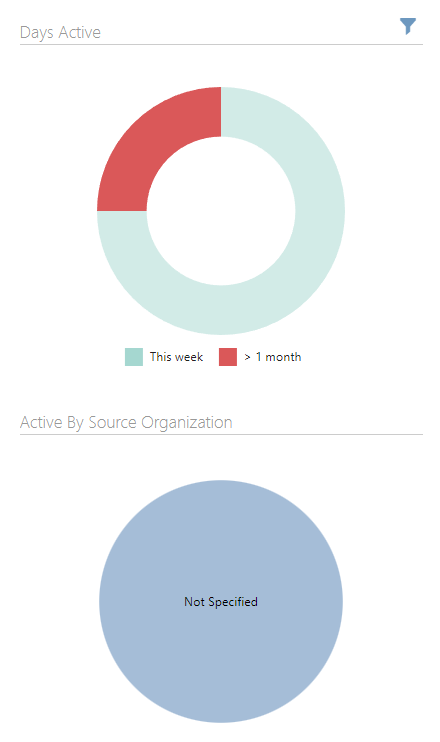
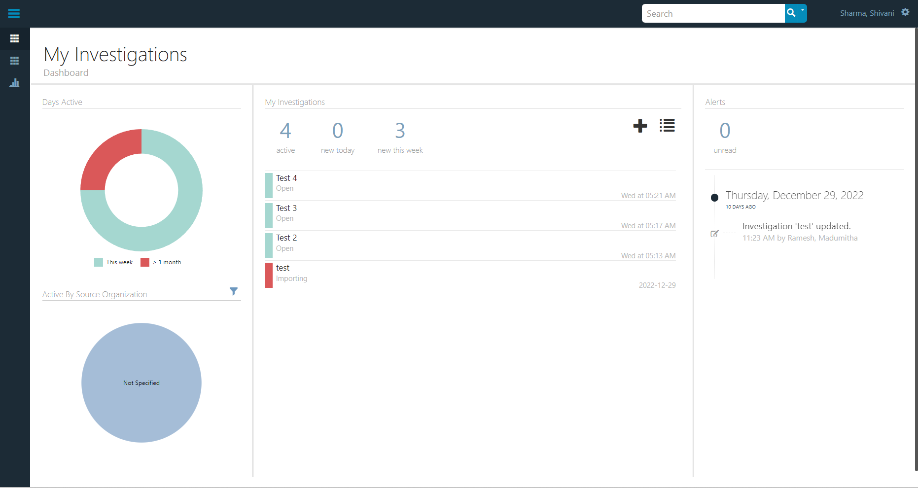
The left panel of the dashboard consists of two visualizations - Days Active Donut Chart and Active By Source Organization Pie Chart.
-
Days Active Donut Chart: It displays an interactive visualization of the days that the user was active for.
-
Active By Source Organization Pie Chart: It displays an interactive visualization of the days that the user was active for by source organization.
-
Filter icon: It only appears if any part of a visualisation is clicked to apply a filter to the list of investigations. Clicking the filter icon removes the filtering and the icon disappears.
To explore a visualization in the left panel, follow the steps given below:
• Hover over various parts of the visualization to see useful insights as tooltips.
• Click the visualization to filter the investigations displayed in the middle panel.
• Click the visualization again to remove the filtering.
Middle panel
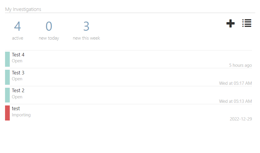
The middle panel shows an overview of the user’s investigations. It contains the following information:
- The total number of active investigations denoted by active
- New investigations on the current day denoted by new today
- New investigations in current week denoted by new this week
This is followed by a list of the investigations created by the user (4).
There are two icons on the top of the middle panel, viz. the plus icon (4) and the list icon (5).
Click on the plus icon to add a new investigation or list icon to view all investigations.
Click on either total number of active investigations, new investigations, or new investigations this week to filter the list of investigations. Click on it again or the freshly appeared filter icon on the top right to remove the filter.
Right panel
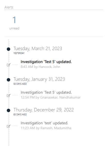
In the right panel, user can view the total number of unread alerts, followed by a general timeline that displays important events in all the investigations created by the user.
The right panel is further divided into the following three parts:
-
Alerts: They act as notifications in Hubstream. At the same time, they filter the timeline events. User can click on the alert number to apply the filtering to the timeline.
-
Timeline: The timeline helps users keep track of all the important events related to all the investigations.
-
Filter icon: The filter icon appears only when the user has clicked an alert and in turn, filtered the timeline. User can click on it to remove the filtering from the timeline. This causes the filter icon to disappear.